Part & Parcel
The company's mission is to build a plus-to-plus community while selling plus-sized clothes, through differentiators like elevated staples, dimensional sizing, and a unique Partner program.
The tagline sums it up nicely: “Clothing, community & a way to earn a living. For plus size women who want more.”
As a freelance designer assisting with the company’s launch, I worked within existing brand standards on a range of projects including logos, digital and print design, and physical merchandise.
LOGO VARIATIONS
Above, from left to right, are a range of logo variations I created. The challenge was to think about how the new logo designs would expand on the existing guidelines while differentiating the various branches and touch points of the business.
& CLUB HOUSE - Part & Parcel needed a logomark for its virtual office, where partners could go to seek resources and education on the products and commission structure.
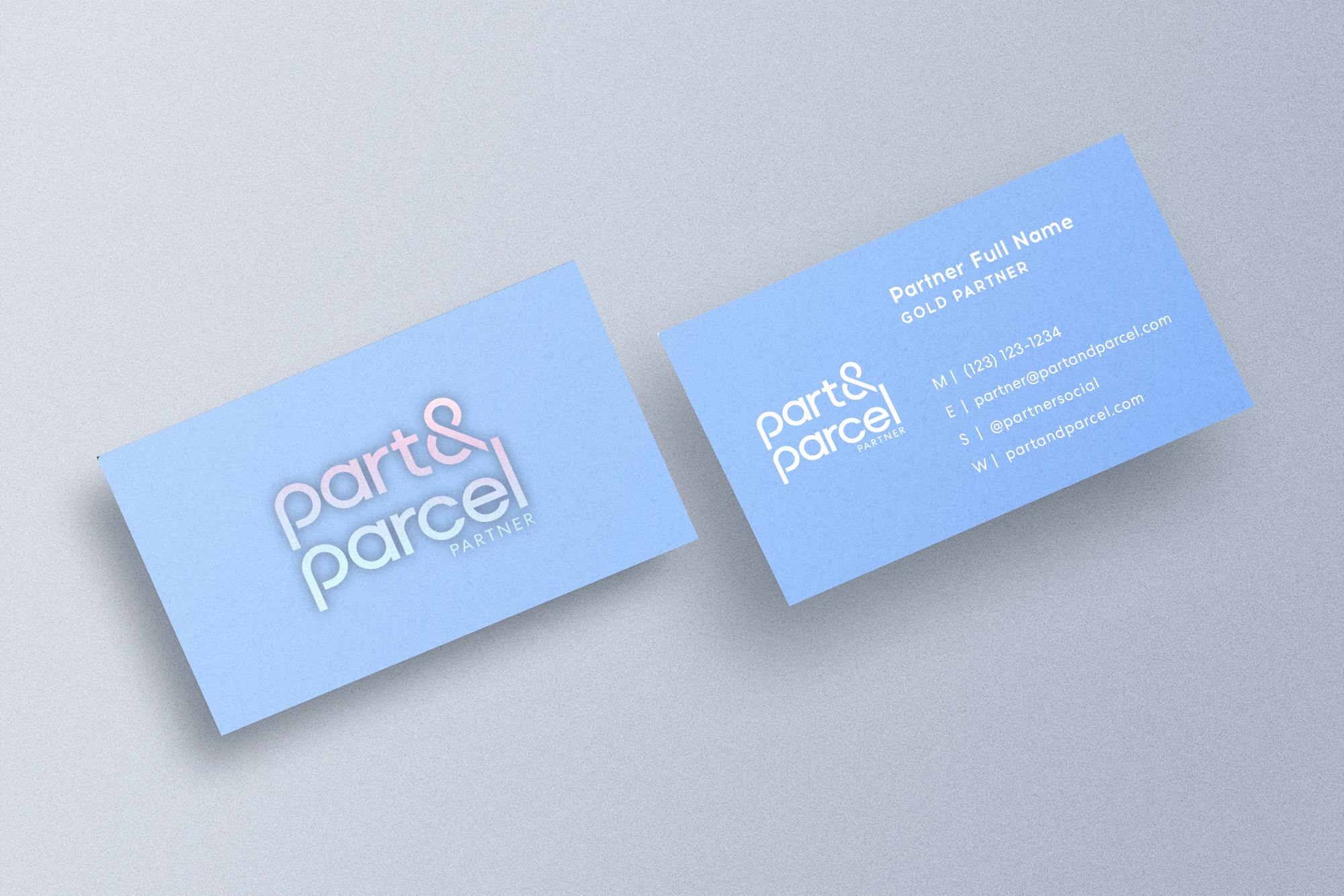
PART & PARCEL PARTNER - The brand needed a logomark for its Partners (seller community) for print and digital assets and physical products such as business cards and credit cards.
THE PEAR SHAPE - The founder’s inspiration for the company all started with her plus-sized fashion blog called The Pear Shape. The ask was to create a new blog logo that better synthesized with Part & Parcel’s look and feel while subtly incorporating the blog’s connection to the brand.


STICKER SHEET